As a general rule that we follow when designing and considering certain themes for your company’s website we always follow the MDM rule. Multilingual / Dynamic / Mobile. This rule is an in house rule that we have been following for the past 15 years with success.
A website first passes through the design phase and with careful planning and a well followed strategy we can avoid any surprises when we get to the development phase. We don’t want to design a theme or concept that isn’t usable after a certain period of time or faces disadvantages when it comes to a future upgrade.
From the many years of experience and the many issues we have faced with third party designers, this article can help companies and individuals to make sure that they are considering important aspects before giving their approval to the designers. Designers may not always be considerate to the important aspects that your site may need.
M = Multilingual
When you are designing a multilingual site it is a must that you consider all languages and not only the default language you are using to design the site. Certain languages have different font sizes and length of text that need to be considered in the space you are providing. E.g. a title on the homepage or the menu items that you have placed. Make sure you have considered the space needed for all languages. Designing a horizontal menu rather than a vertical menu for example may not be an option. Even though you can make different menus for different languages it’s good to be consistent throughout your website.
D = Dynamic
When developing your website using a CMS, which is mostly the case, it is critical that the design adapts to a dynamic environment. You have to consider that the elements in your design will be controlled through a BackOffice. Even though we discuss the argument “why should we sacrifice design for control” very often, we always eventually agree with the client that the advantages to controlling most of your content by far outweigh the sacrifice to the design. Keep the design “simple” so that it is controllable. Make sure the design is structured in a way to consider future expansion/growth of the site also. You don’t want to find yourself with limitations 5 months later when adding further content.
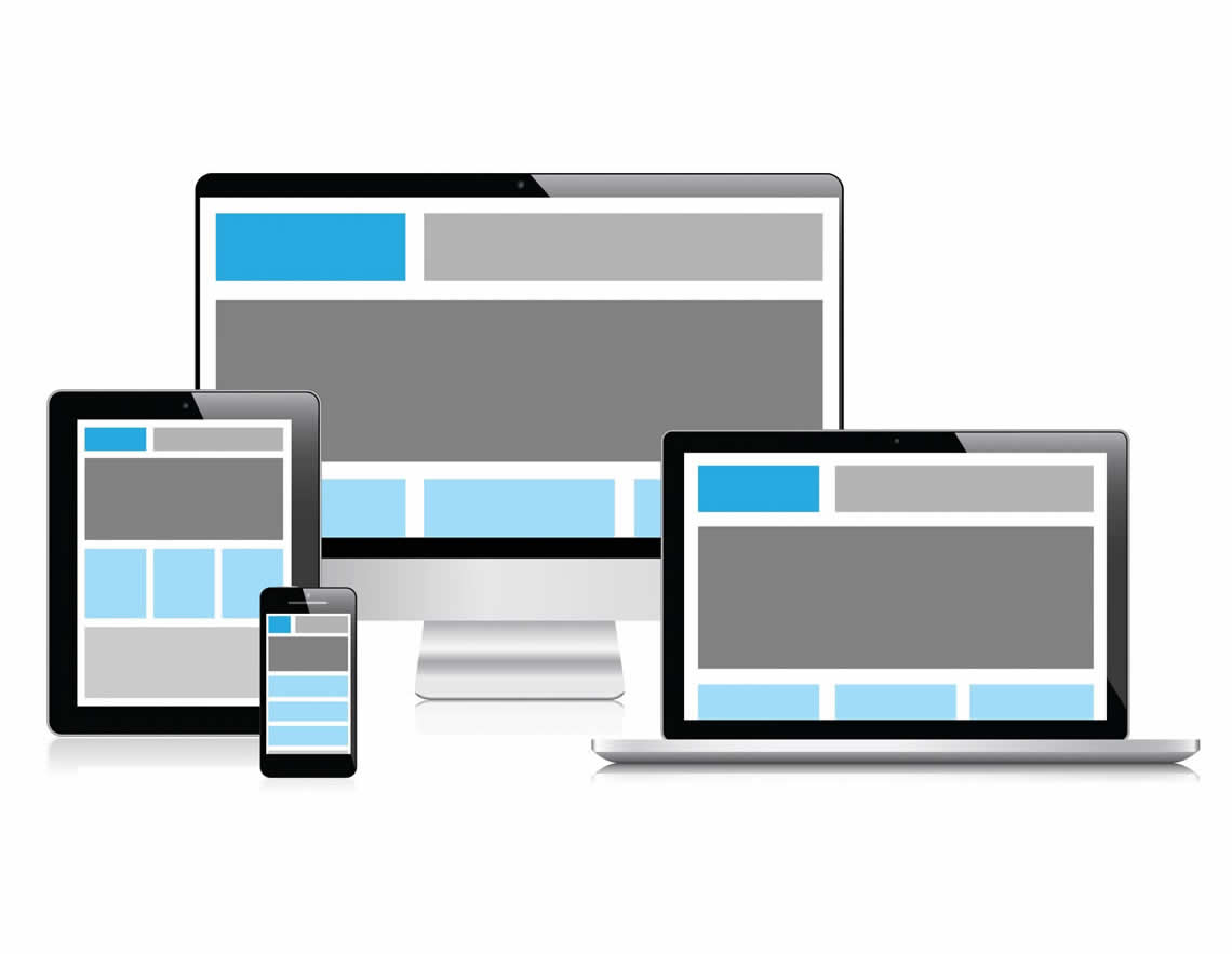
M = Mobile
Mobile refers to the term “responsive design”. As we move forward in this technology driven world there are so many devices that could read your site, from smaller desktop screens to laptops to small smart phones. This means that you need to consider all options when approving your design. In some scenarios it may be better to start your design working backwards from a small mobile phone. Another solution would be to develop a mobile version if your design cannot accommodate small screens or even omit certain elements from the smaller views of the site. I have mentioned “Simple” design above a few times but this should not be misunderstood that your site should look inferior to other sites.
CONCLUSION
Before approving the design of your new website consider the MDM rule to avoid any frustration and further expenses down the line. Preparation is key to being able to controlling, viewing and growing your site.